Showdown - Brand Identity
The Brief

THE DUEL
BEGINS.

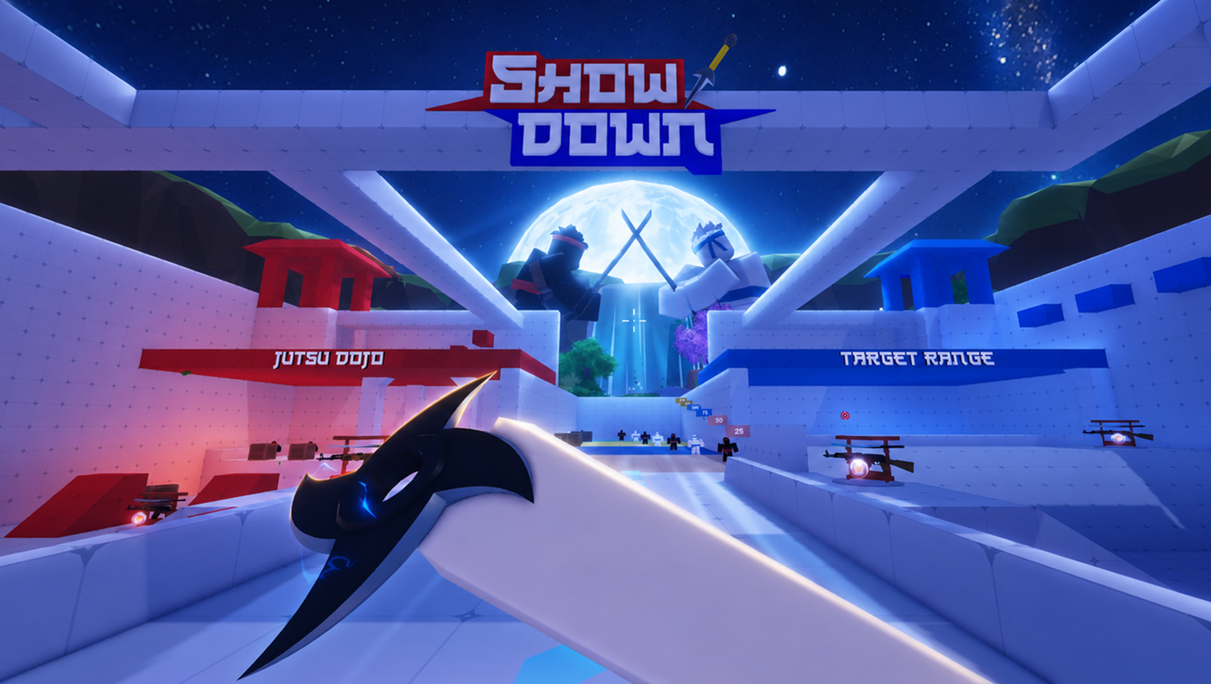
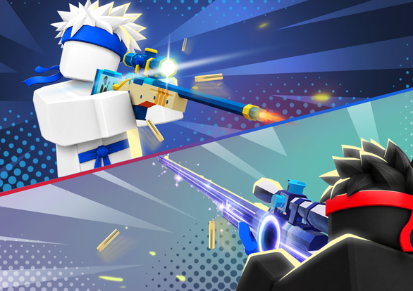
Showdown is a competitive ninja arena FPS built on Roblox. The brief: build a brand that behaves like a real game identity - not a Roblox skin. Starting from zero IP equity, every decision had to make players feel allegiance to something before they'd played a single match.

Game
Showdown - Ninja Arena FPS
Platform
Roblox
Studio
SuperGaming
Year
2025 – 2026
The Challenge

WHO PLAYS
ROBLOX.

Before touching the logo, we mapped the Roblox player base. The constraint: this audience had seen thousands of forgettable game brands. Every visual decision had to earn attention or lose it in the catalog.
01 · AGE GROUP
Core audience: ages 9–16
Roblox's player base skews young and energetic. They expect bold, high-contrast visuals.
02 · VISUAL LANGUAGE
They respond to competition cues
Red vs Blue is deeply ingrained in gaming culture for this age group - team sports, arena games, anime.
03 · PLATFORM CONTEXT
Standing out in a sea of games
Roblox has millions of games. Most look generic. A professional brand identity was the differentiator.
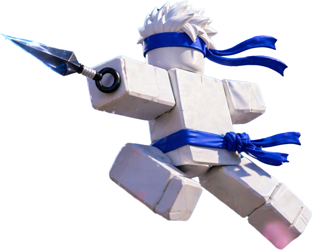
Showdown ninja character
GAME TRAILER
Logo & Identity

THE DUEL
PRINCIPLE.

Two forces. One clash. The core creative decision was to resist complexity and commit to a single binary tension. Red challenges, Blue responds - a spatial rule that governs every screen, every layout, every element. Simple enough to scale. Strong enough to feel like a world.

Showdown logo
Showdown logo minimum size
Minimum
30 px
Showdown symbol
Symbol
Showdown Red
THE CHALLENGE.

Primary action. Selected states. CTA buttons. Every moment of conflict and assertion. Red is aggression - controlled, intentional, competitive.

#E63946
Showdown Blue
THE COMEBACK.

Active navigation. Info panels. Right-side layouts. Blue is the counter-move - tactical, responsive, and always ready to flip the score.

#1E5BC6
Colour & Typography

TWO COLORS
FIGHT.
THE REST HOLD SPACE.

Primary Duel
SHOWDOWN RED
#E63946 · RGB 230 · 57 · 70
Primary Duel
SHOWDOWN BLUE
#1E5BC6 · RGB 30 · 91 · 198
Paper
Surface
Slate
Ink
Typography

Three fonts. Each one does a specific job and never swaps roles.

01
Display
Bangers
SHOWDOWN
Impact moments. Titles, hero stats, posters. All caps.
02
Body / UI
Inter
Clear. Modern. Neutral.
Headlines, paragraphs, captions, all UI copy.
03
Data / Mono
JetBrains Mono
3,127,448
Stats, scores, timers, prices. Digits never shift.
Brand Guide

THE VISUAL
LANGUAGE
BEHIND THE DUEL.

A comprehensive brand guide delivered to the studio - covering not just what to use, but why. Written to be followed by devs, artists, and stakeholders alike. The kind of document that keeps a brand coherent as the team grows and the game scales.
01
The Duel Principle
Left = Red = challenge. Right = Blue = response. Every layout, every screen, every split reflects this spatial rule.
02
Shape Language
Angular, never rounded. Parallelogram headers, kunai chip badges, slashed dividers. Every form has a fighting edge.
03
Tone & Personality
Bold but not cringe. Playful but not childish. Competitive but fair. Sharp, confident, and made for players who mean it.
BOLD
Aggressive but not cringe
PLAYFUL
Fun but not childish
CONFIDENT
Competitive but fair
SHARP
Angular, never rounded
Showdown Duels brand guide spread
Identity in the UI

SYSTEM
THINKING.

The brand guide extended into a full UI design system - covering surface hierarchy, component states, rarity tiers, and interaction rules. Every element maps back to the Duel Principle. This is how a brand identity becomes a game.

Showdown defeat result screen
Result screen · Defeat state
Showdown store screen
Store · Bundles & skins
Showdown armory kill card
Armory · Kill card customisation
Result 5 MILLION Roblox visits - and still playing

A competitive ninja arena that built a fanbase before most Roblox games find their first hundred players. The brand held - from the logo to the UI, from the store to the kill card. That's what a real identity system does: it scales without breaking.